
How Your School Can Best Dynamic Leverage Hero Banners
Hero banners are a great way to showcase what makes your university unique. They can feature an image of a central hub and campus, a picture of students gathering in the library to study, a homecoming celebration, or other on-campus highlights.
Higher education sites have begun to catch on to digital marketing trends including integrating interactivity and short videos. Designing a great banner is all about getting creative and using different visuals to show what values your institution upholds and what campus life is all about.
Making your college or university stand out can be done in a few different ways. It's important that when a website is being designed or redesigned, the overall brand identity of the university or college is upheld throughout the entire process, and the integrity of the content quality is maintained.
Below are a few examples of higher education institutions that have designed stellar hero banners to grab the user attention from the very beginning of their site journey and help guide them through an optimized visit across their web content.

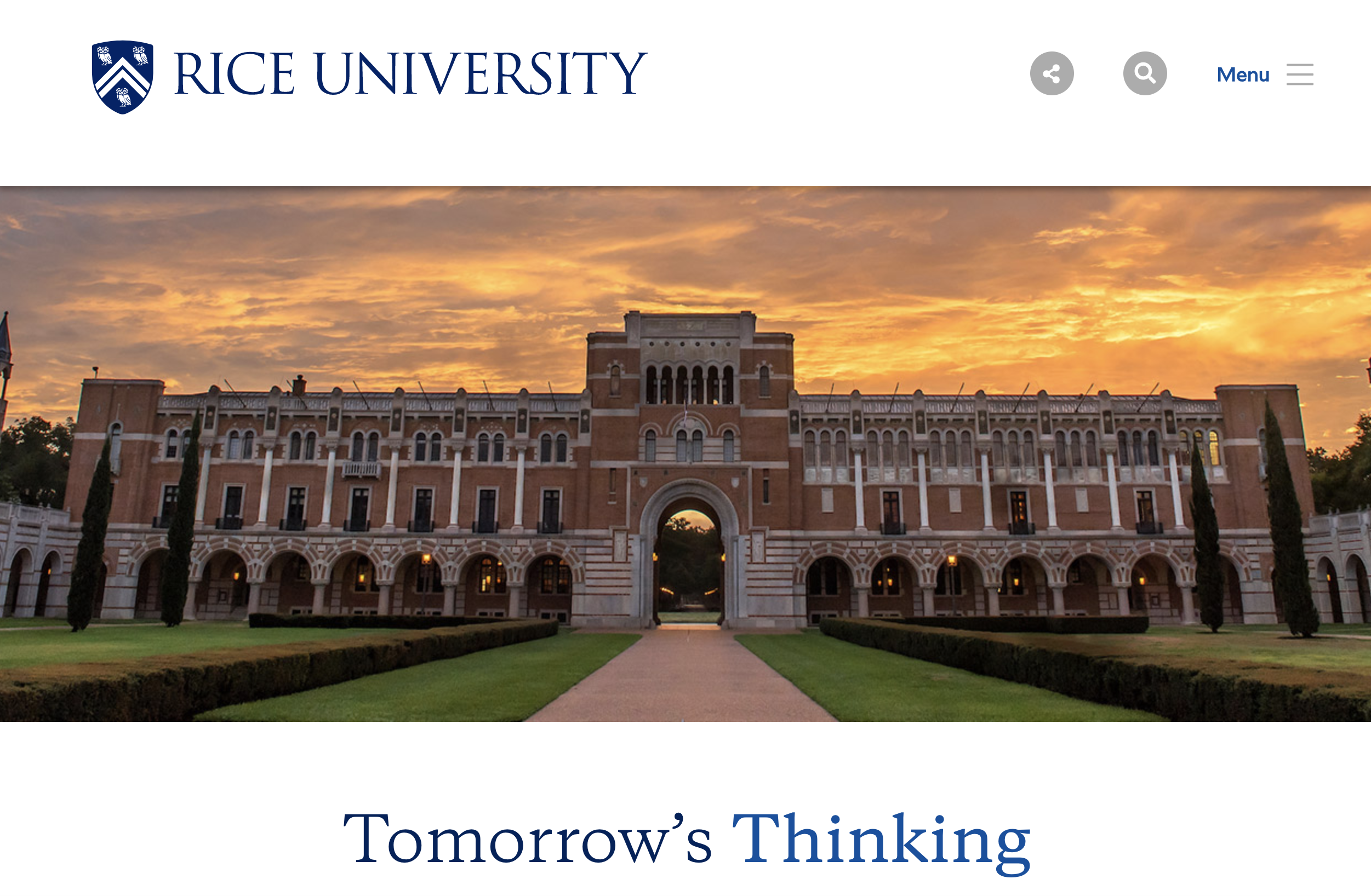
1. RICE UNIVERSITY
Rice University uses a hero banner that features a picture a picture of a prominent building on its campus. The homepage has a clean design and the information is concisely presented for users to easily find what they are looking for. Visitors are able to follow the various calls to action and are easily guided through the site to the information they are searching for.
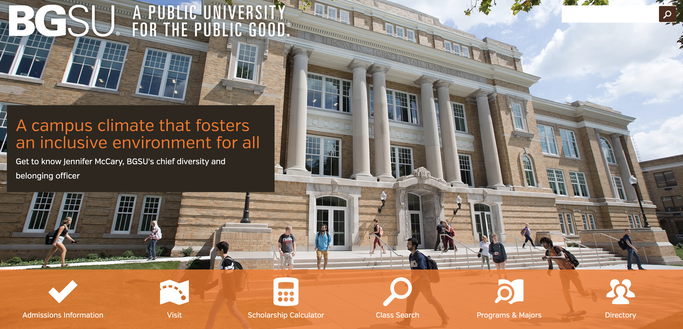
2. BOWLING GREEN STATE UNIVERSITY
Like Rice University, Bowling Green State University uses one high-quality hero image. This website takes the design a step further by adding compelling, clickable icons to the bottom of the image where prospective students can click through to different content areas of the website.
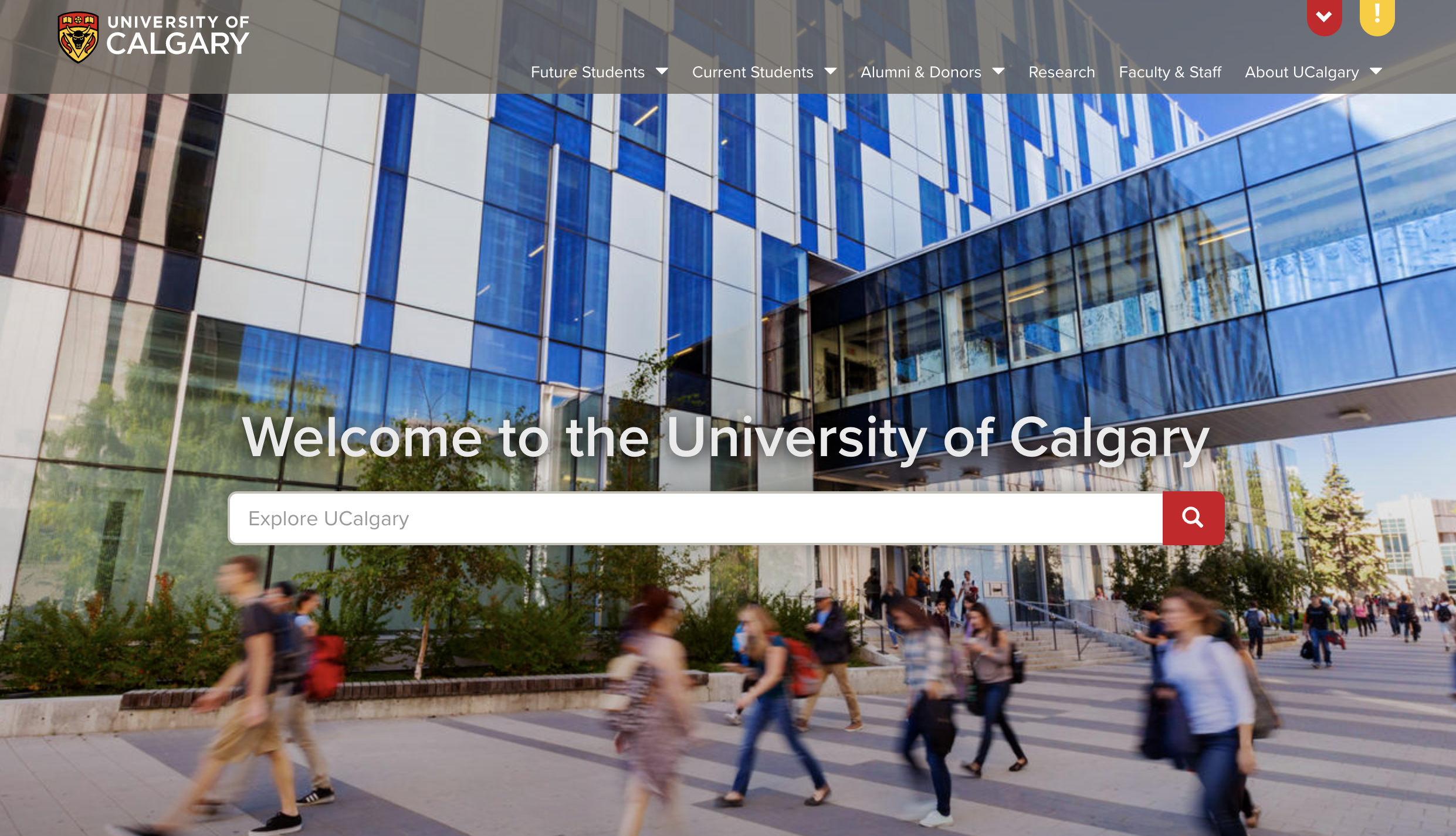
3. UNIVERSITY OF CALGARY
The University of Calgary also uses a hero banner image. They have chosen a bold photograph and added a search bar directly in the middle of the banner. Instead of having to scroll through lengthy menus or lists, this allows visitors to key in and search more precisely for exactly what they are looking for, saving time and optimizing their overall site experience.
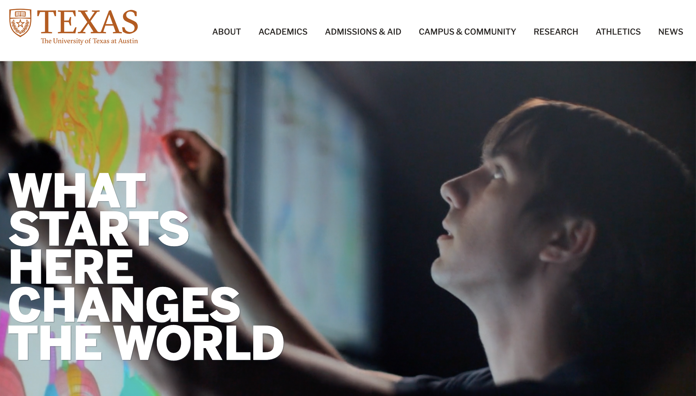
4. THE UNIVERSITY OF TEXAS AT AUSTIN
The University of Texas at Austin has designed a header that is simple and sharp, with high-quality images that display different aspects of the university's academic life and culture. The banner has minimal text which encourages potential students to explore and take their own path to tour through the website.
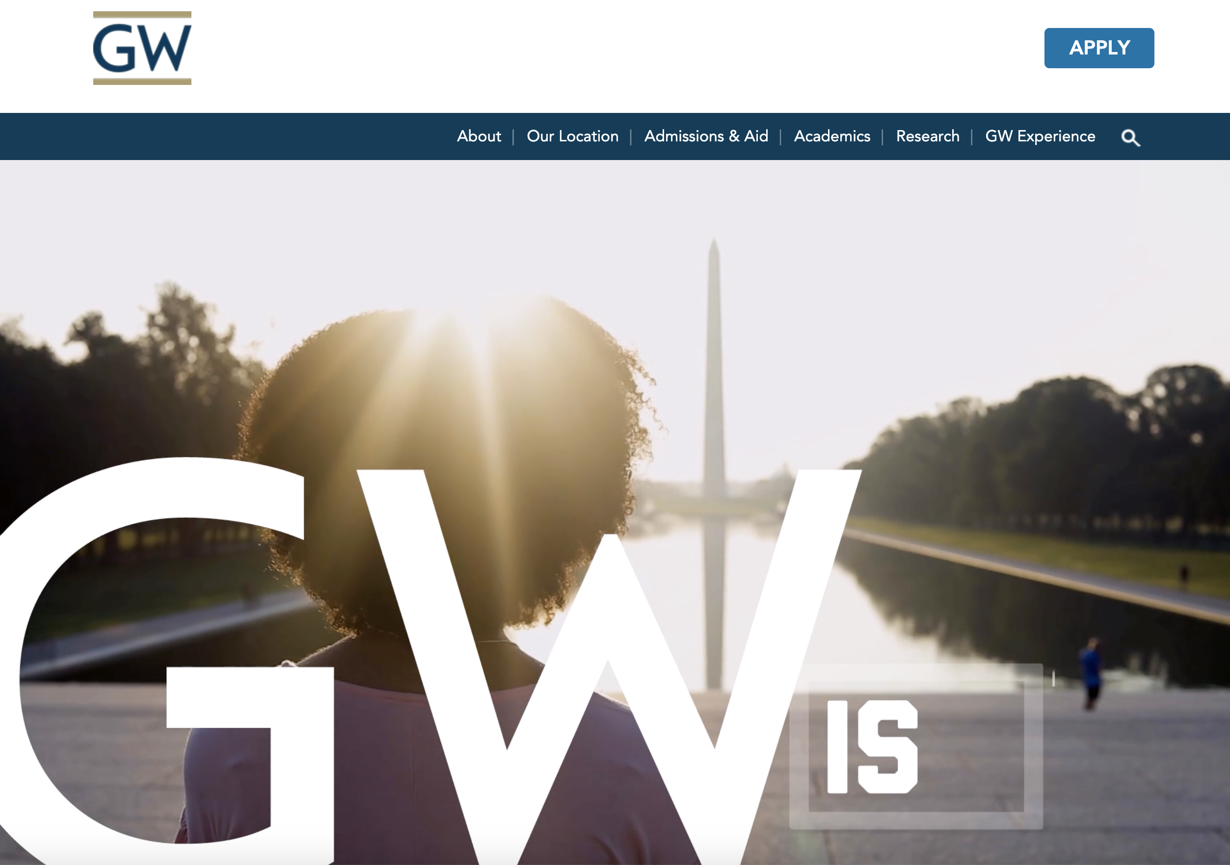
5. GEORGE WASHINGTON UNIVERSITY
In the case of George Washington University, their hero banner appears underneath the navigation menu and includes a short, looped video. The video content showcases what distinguishes the university, from its cultural programs, academics, athletics, and community involvement. When a visitor leaves this website, the dynamic visuals will help them formulate an idea of what it would be like to attend this university.
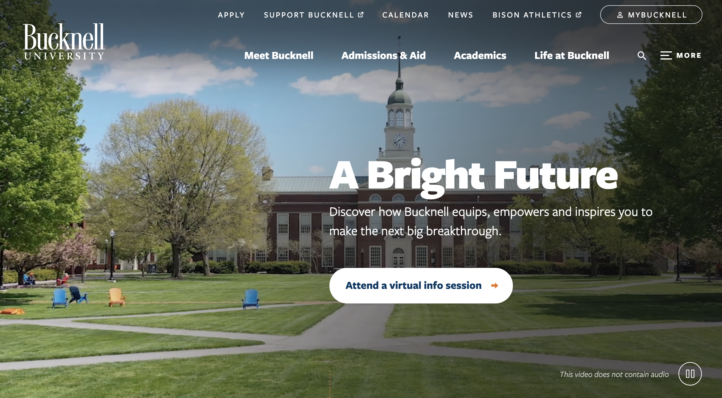
6. BUCKNELL UNIVERSITY
Similar to George Washington University, Bucknell University uses a video in its header as an engaging visual aspect that captivates prospective students. By using negative space along with clean website navigation, users will easily be directed to the information they are looking for. This simplifies the journey for site visitors by eliminating areas of confusion where desired content is buried deep within sub-menus, making for a more optimized browsing experience.
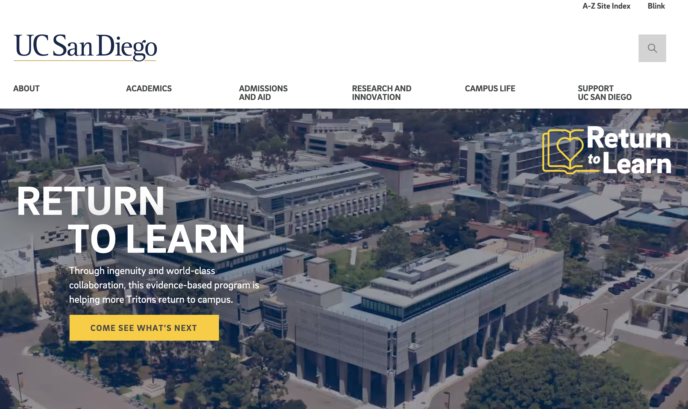
7. UC SAN DIEGO
UC San Diego includes the use of a video in their hero banners. This header stands out due to the use of whitespace and a specific, high-contrast call to action button directly on the banner. Their compelling copy addresses different personas, including prospective high school students or those looking to continue their education.
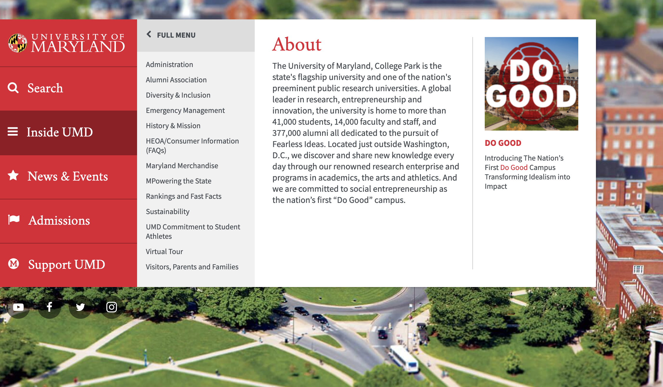
8. UNIVERSITY OF MARYLAND
The University of Maryland designed its header to be interactive, featuring five different categories on the navigation menu. As website visitors scroll down the homepage, the responsive navigation bar automatically expands, encouraging users to click through and explore different areas of the website.
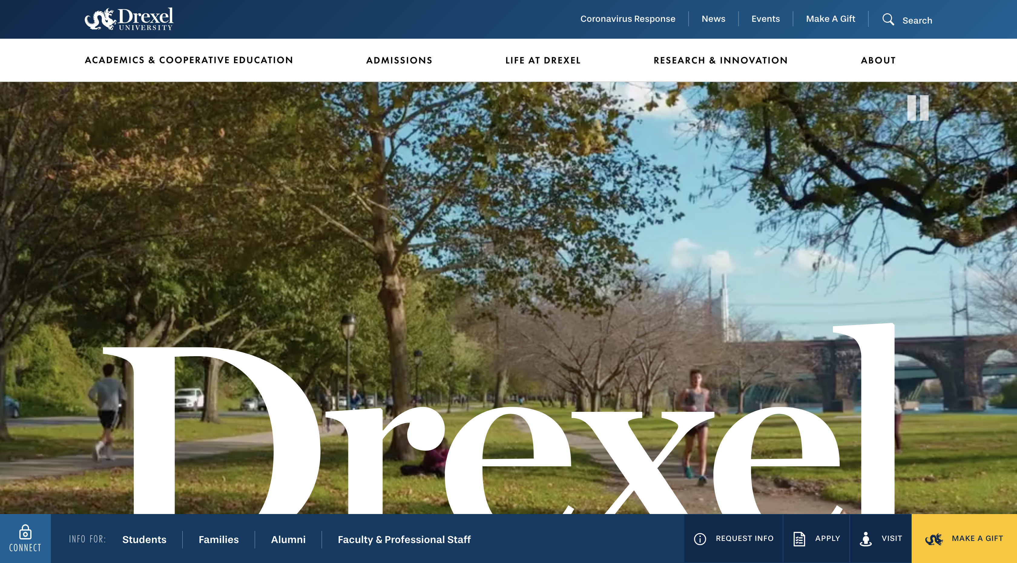
9. DREXEL UNIVERSITY
Drexel University is another great example of how interactive a header can be. With this design, there is no need for visitors to click through dispersed pages aimlessly. Users can be guided through their journey and audiences can explore with a greater purpose. The bold use of contrasting colours and engaging photography appeals to their future student demographic.
Summary
Headers can present a lot of information to users and serve as a first impression for your institution. When visitors land on your website, they should be able to immediately interpret what your institution stands for and be easily guided through a segmented journey that enables them to envision themselves enrolled as a student.
Portage CyberTech partners with foremost institutions of higher education, helping them break through the noise and create industry-leading web designs. Portage's data-driven and focused approach to user experience design plays a key role in all of our work.
If you are interested in starting your journey towards a more engaging and personalized digital experience for you college or university website, reach out to our team of experts today.